Templates
Every template styles the whole site: pages, the blog, the shop and forms. Each one has presets and a Design screen where you change colors, fonts, sizes and buttons with a live preview, and text that would be hard to read is refused before it saves. Switch between them under Settings: your pages, articles and products stay as they are. A block that belongs to one template, such as Glass's screen tour, shows only while that template is in use.
Six come with every copy. Hearth is in the Marketplace.
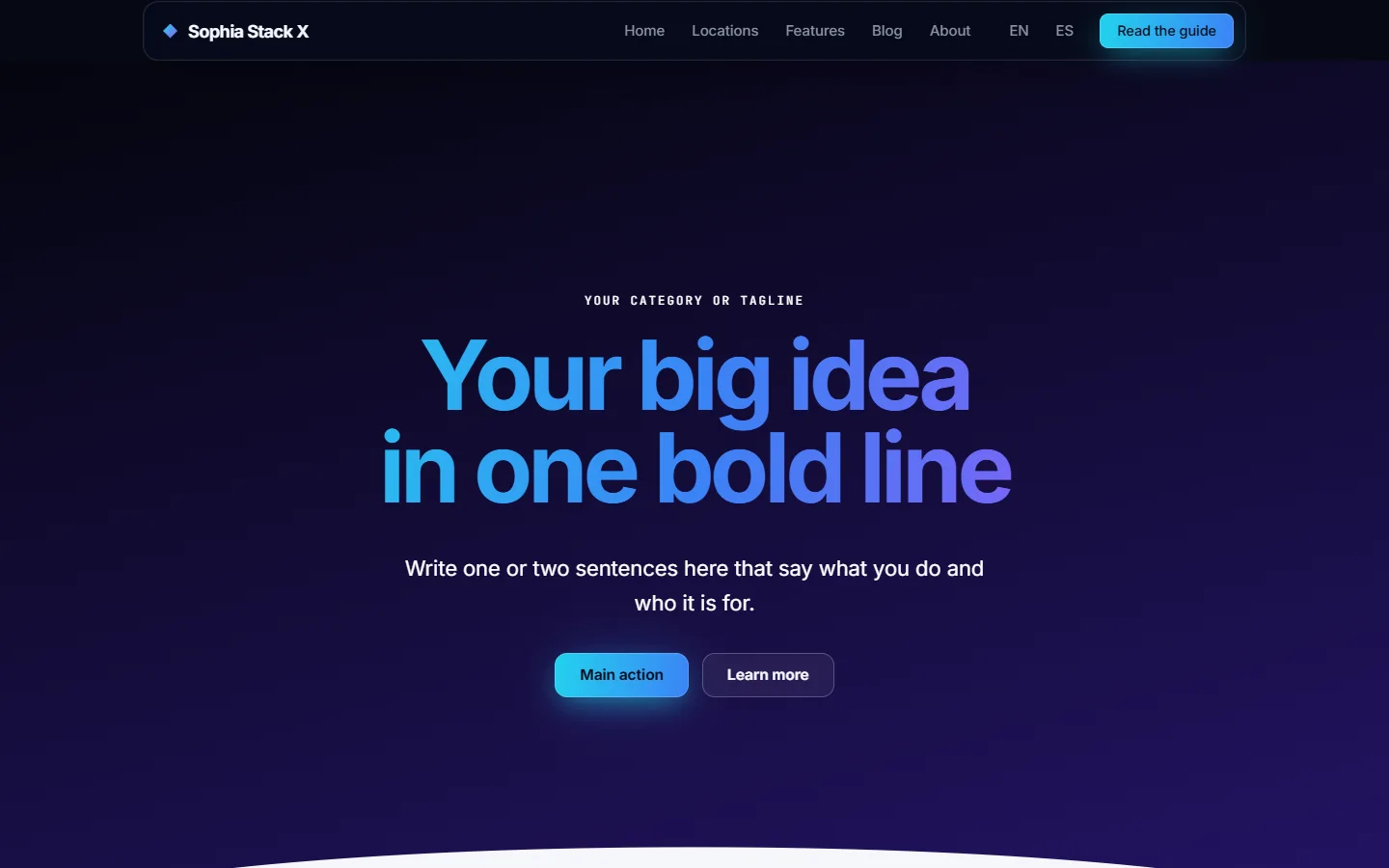
Nova
A dark space look for software, launches, agencies and anything that should feel new: a starry grid behind everything, headlines in a cyan, blue and violet gradient, frosted glass cards, glowing buttons and a tilted frame for product screenshots. It pairs with the section library, so a whole landing page goes together in minutes.
- Presets: nova (cyan, blue and violet), aurora (mint and teal), nebula rose, solar (amber and coral), deep blue
- Works with section effects: glass, glow shadows, wave dividers and entrance motion
Trade
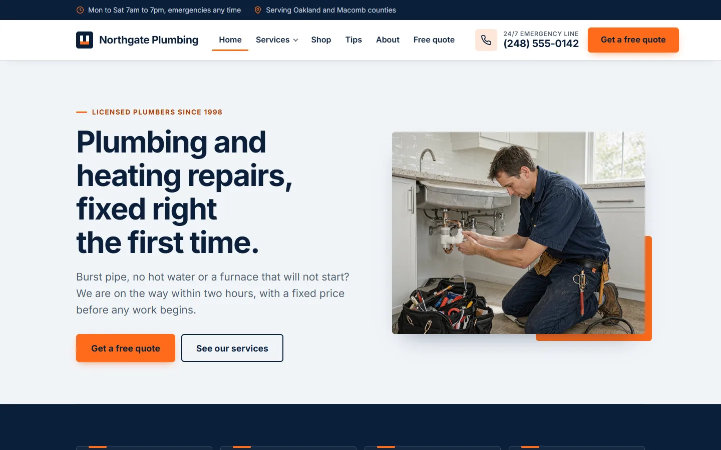
For local service businesses: contractors, plumbers, electricians, landscapers, cleaners, salons and clinics. A tap-to-call number in the header, a call bar that stays on screen on phones, service tiles, testimonials and a quote form built to be filled in.
- Presets: navy and safety orange, night shift, green trades, clinic blue, black and yellow
- Settings for the phone number, hours and service area
Studio
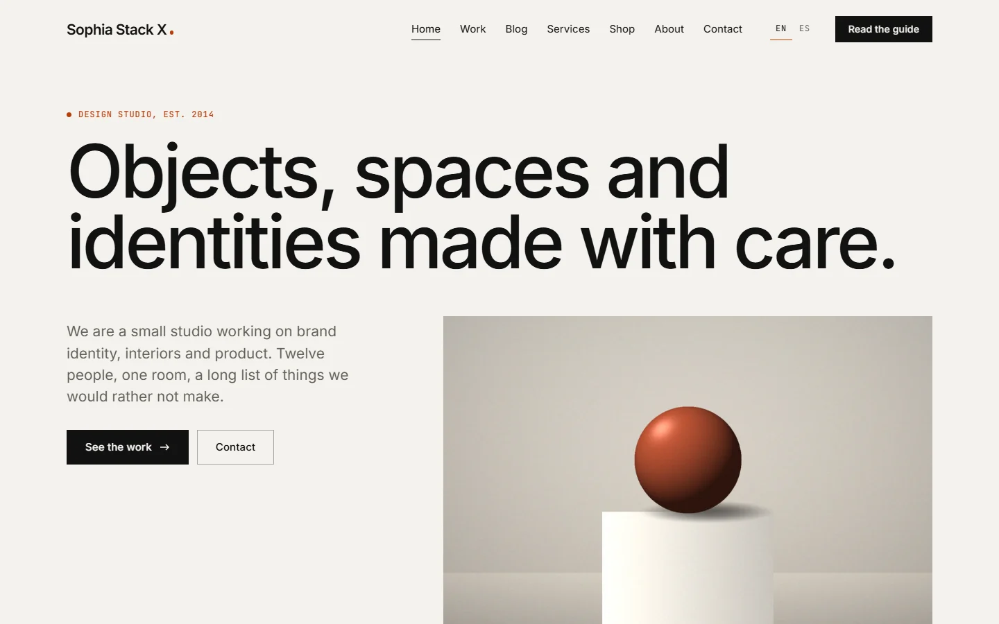
For designers, photographers, architects and small agencies. Large headlines, quiet colors with one accent, picture-led project cards and motion that settles as you scroll.
- Presets: studio, gallery white, editorial serif, sage, darkroom, gallery black
- Card shape, section spacing and headline weight on the Design screen
Journal
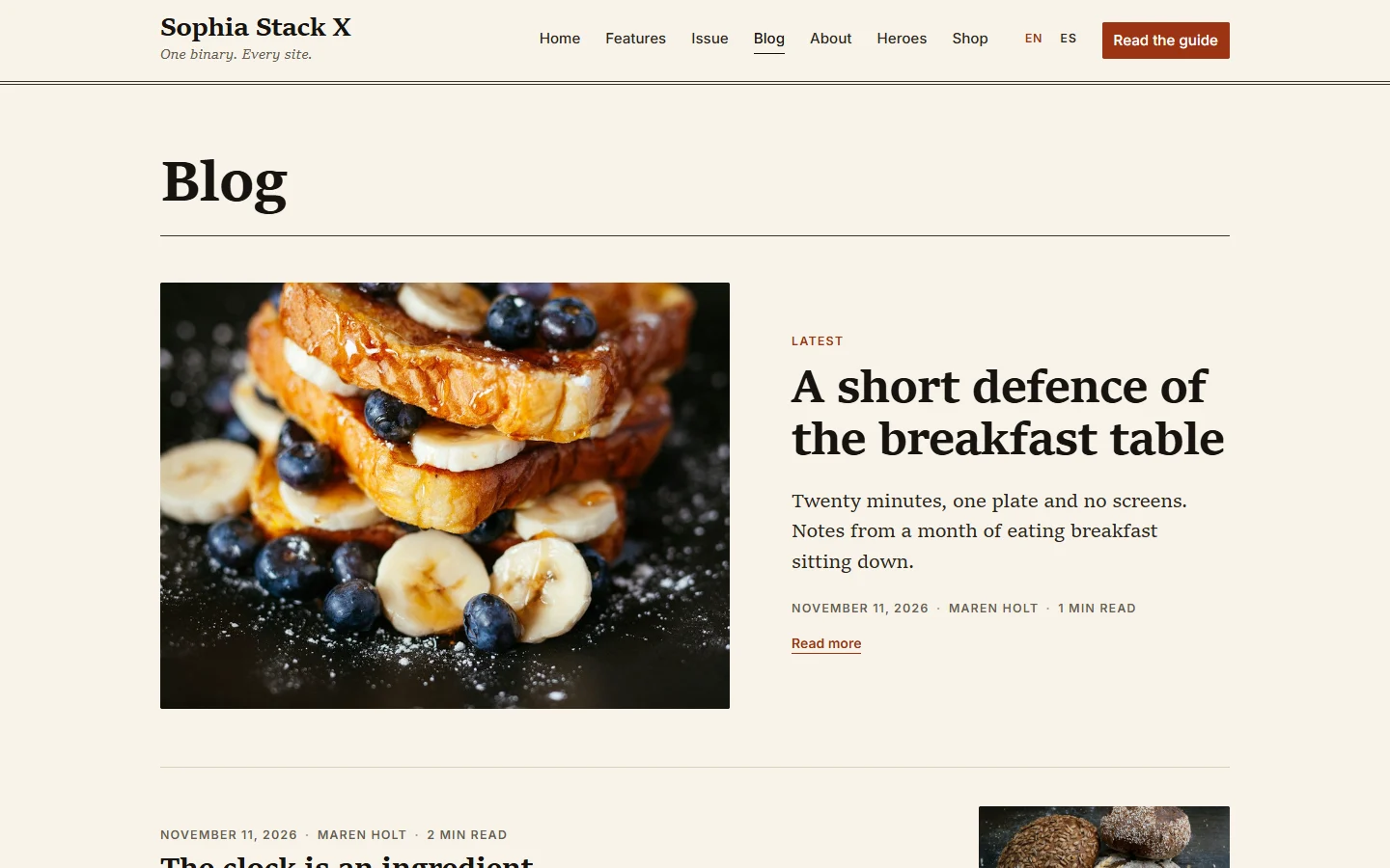
For writers, newsletters, magazines and nonprofits, where reading comes first. Serif text at a comfortable line length, the newest article set large, reading time, drop caps, pull quotes and a signup panel.
- Presets: paper, night reading, sepia, newsprint, harbor blue
- Line length, text size, drop cap and end mark on the Design screen
Aurora
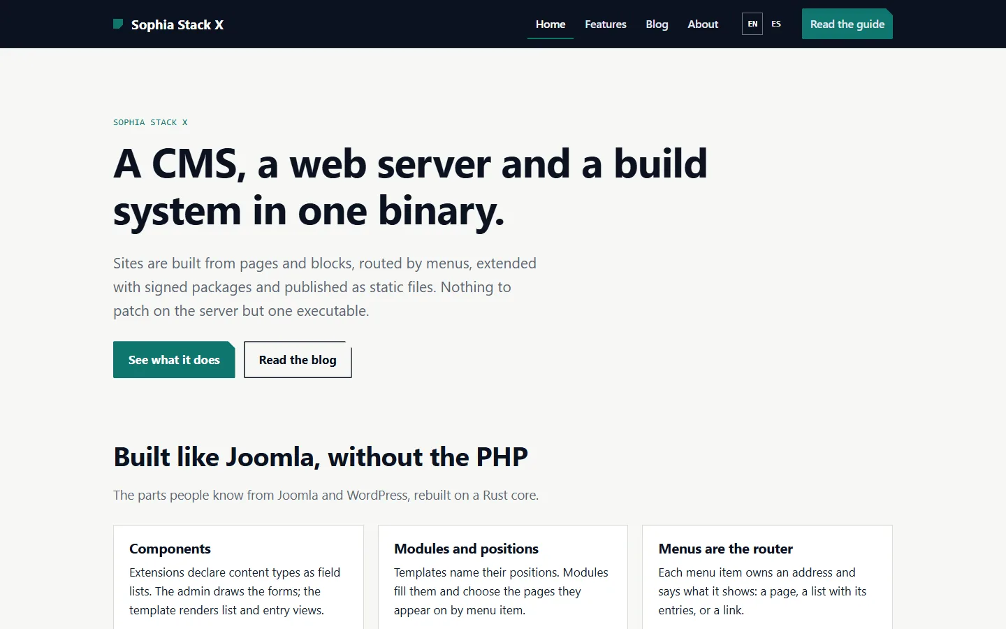
The default. Engineered and fast, with nine module positions, a sidebar and an accent color. A good start for a business site, documentation or anything you want to shape yourself.
- Presets: Aurora, Harbor, Ember, Grove, Night
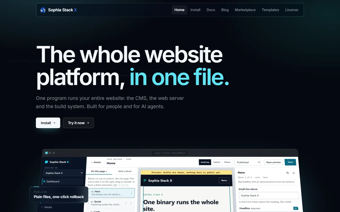
Glass
Dark glass panels over a lit lattice, for software and product sites. Screenshots in window frames, a screen tour, feature grids and an install panel. This site uses it.
- Its own blocks: glass hero, feature grid, screen tour, split, marquee and install panel
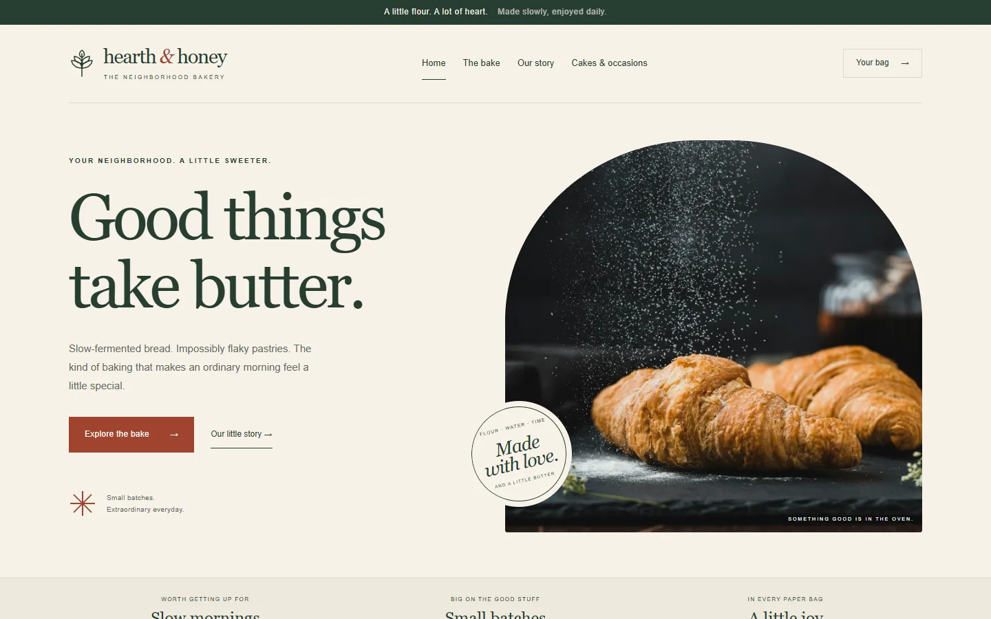
Hearth
An editorial bakery template with its own hero and story blocks, in the Marketplace. The bakery starter in setup and in the demo workspace uses it.
- Install: Extensions, then Get more from the marketplace, or sophia market-install hearth
Try one
Build a bakery in a private workspace and change its colors, fonts and buttons on the Design screen, or install and pick any of these on the setup page. To make your own, start with sophia new template <name> and see Building extensions.